


Year
Q3 2023
Client
Ribica
Role
Product Designer
Overview
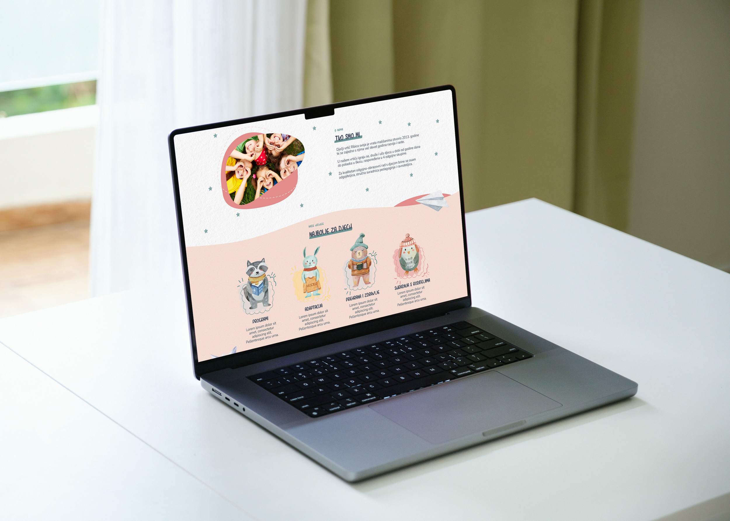
Ribica Kindergarten is a nature inspired early education center focused on creating a warm, supportive environment for children. I was brought in to redesign their website with the goal of helping parents better understand the school’s philosophy and feel confident in taking the next step.
The project focused on improving clarity, building trust, and guiding users through a decision making journey that leads to enrollment.
Problem
The existing website failed to support parents in making an informed decision.
Key information was difficult to find, the structure lacked clarity, and the overall experience did not communicate the school’s values effectively. As a result, parents relied on phone calls to ask basic questions, creating friction in the decision process and limiting conversion.

Key Decisions
To support parent decision making, I focused on reducing uncertainty and building trust throughout the experience.
Structured the content flow to move from emotional connection → practical information → clear calls to action
Prioritized key questions parents typically ask (education approach, daily routines, adaptation process) and made them easily accessible
Designed a calm and friendly visual language to reinforce trust and emotional comfort
Placed calls to action strategically to support decision-making without creating pressure
Process
I began with stakeholder interviews and a collaborative content workshop to identify key messages and priorities. This helped define what parents need to understand before making a decision.
I then analyzed competitor patterns and identified a gap: most competitors were either too sterile or overly chaotic, failing to create a balanced emotional experience.
Based on these insights, I structured the information architecture and user flow to guide users from exploration to action.
Wireframes were used to define layout and hierarchy, followed by high-fidelity designs that translated the experience into a cohesive visual system.
Design Approach
The visual language was designed to support both clarity and emotional engagement.
A soft, nature inspired color palette to create a calm and welcoming atmosphere
A combination of playful and readable typography to balance warmth and usability
Custom illustrations and visual metaphors to support storytelling and guide users through the experience
Outcome
The final website delivers a cohesive and delightful digital experience that fully reflects Ribica’s ethos. Parents are greeted with a clear and engaging visual narrative that communicates the school’s philosophy while allowing them to explore the content at their own pace, all within a thoughtfully structured page layout.
To assess the design’s effectiveness, I conducted lightweight user testing with eleven parents from the target audience. Feedback showed that users could easily find relevant information, felt emotionally connected to the school’s message and appreciated the site’s tone and clarity.
%83
increase in website traffic within
the first two months
2:45
average time on page, signaling strong engagement
%75
fewer phone inquiries, proving website effectiveness
x8
more enrollment inquiries compared to the previous quarter
Parents consistently praised the site’s gentle tone, clear structure and emotional appeal. Several noted that the site alone was enough to make them feel confident in reaching out without needing additional research.
This project demonstrates how a well crafted UX strategy paired with emotionally intelligent UI design can lead to measurable results, blending clarity, trust building and storytelling into a compelling digital experience.