

Client
2WWS
Role
Product Designer
Year
Q3 2024
Overview
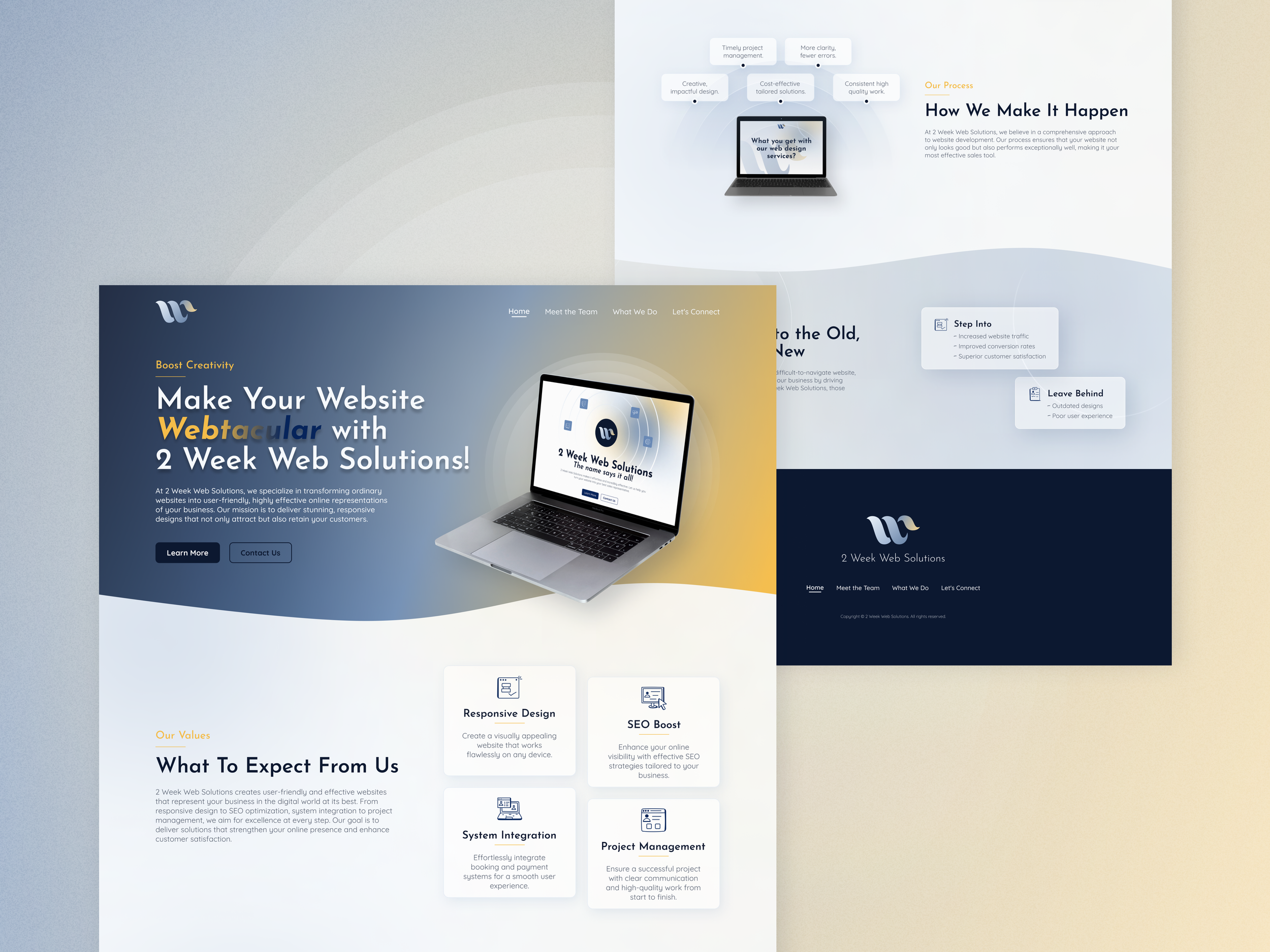
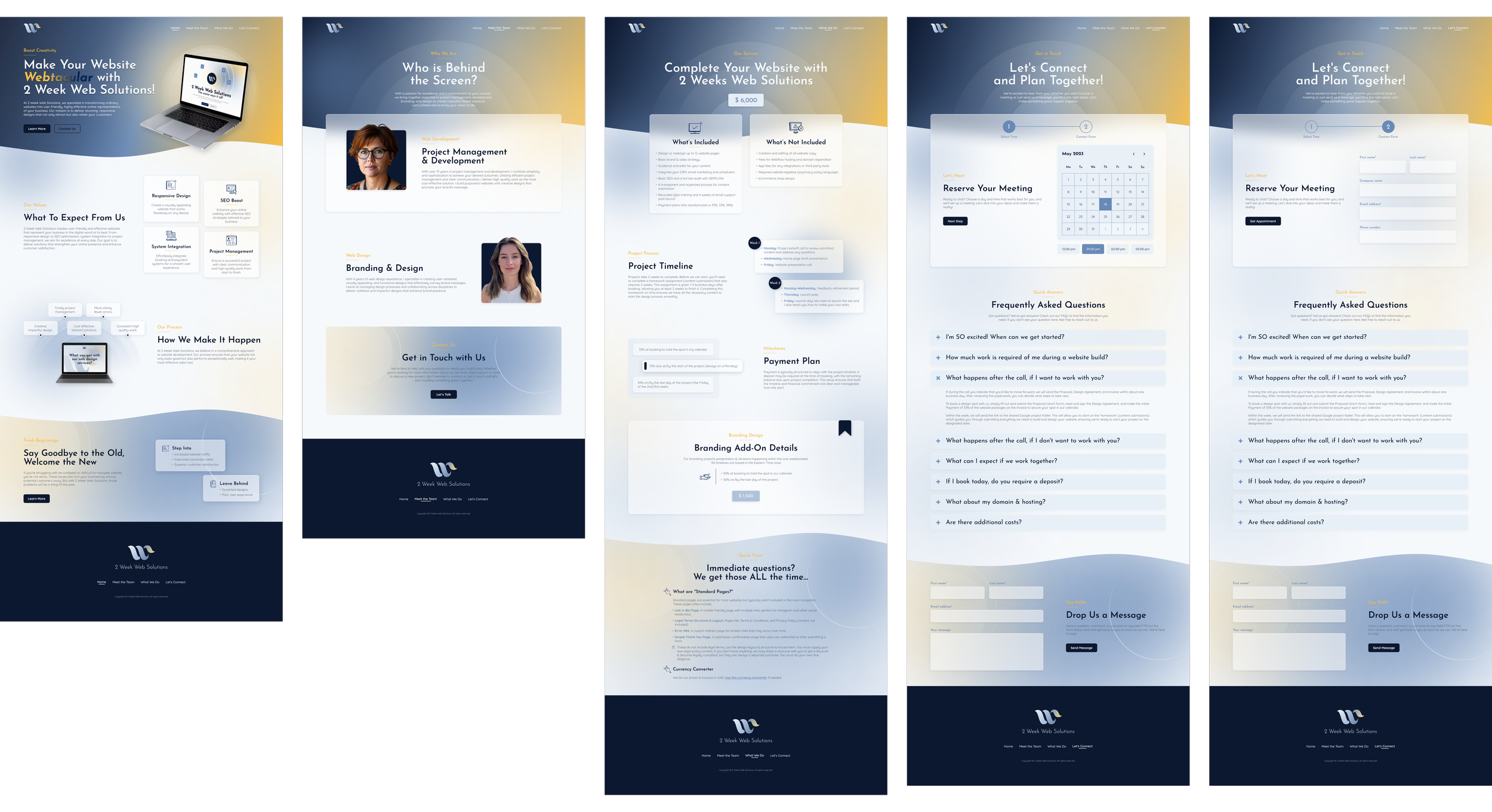
2WWS offers fast turnaround web solutions for small businesses and entrepreneurs. I worked on redesigning their website to better communicate the service offering and guide users quickly toward taking action.
The focus was on improving clarity, reinforcing the value proposition, and supporting a fast decision making process aligned with the brand’s promise of speed.
Problem
Users struggled to quickly understand what the service offered and how it worked. The existing experience did not clearly communicate the value or guide users toward the next step, creating friction in the conversion flow.
Goal 1
Communicate the core value of the service clearly within the first few seconds
Goal 2
Help users quickly understand how the service works and what to expect
Goal 4
Reflect the brand’s promise of speed through clear structure and interaction design
Goal 3
Reduce friction in the journey from landing page to contact action
Key Decisions
No extensive user research was conducted for this project, but industry analysis To support faster decision making, I focused on clarity and reducing friction throughout the experience.
Prioritized the value proposition and key actions within the first screen
Structured the content to guide users directly from understanding → trust → action
Reduced visual and interaction complexity to support quick scanning
Designed clear and consistent call-to-action points to improve conversion flow
Process
I analyzed similar service based platforms to identify common patterns in content structure and user flow. Based on these insights, I defined the information architecture and mapped a simplified user journey from landing to contact.
Wireframes were used to test layout, content hierarchy, and CTA placement, followed by high-fidelity designs focused on clarity and readability across all devices.
Design Approach
The visual design was intentionally minimal and structured to support quick understanding.
Clean typography and large headings to improve readability
A soft, neutral color palette to create a professional and accessible tone
Reduced visual noise to keep focus on key messages and actions
Outcome
The redesigned experience improved clarity and made the service offering easier to understand.
Reduced friction in the user journey from landing to contact
Improved visibility of key messages and actions
Created a more direct and conversion-focused flow aligned with the brand’s promise