

Year
Q4 20224
Client
Lisa&
Role
Product Designer
Overview
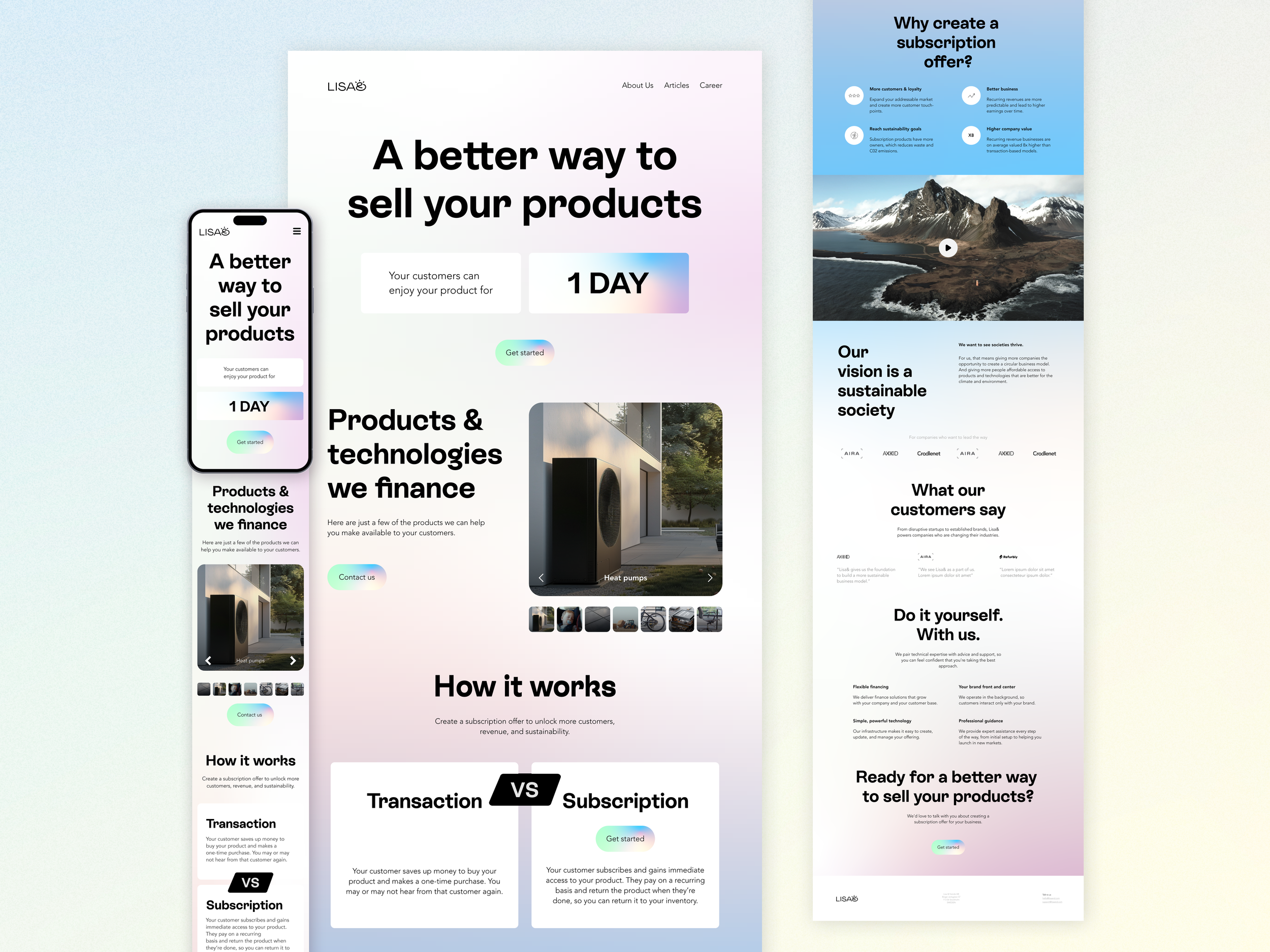
Lisa& is a Stockholm based fintech company focused on simplifying everyday financial interactions. I worked closely with the team to redesign the website and rethink the payment experience, with the goal of making complex financial actions feel clear, trustworthy, and easy to complete.
I was responsible for the end-to-end design of the responsive web experience, including restructuring the information architecture and designing a custom multi-step payment flow.
Problem
The existing experience lacked structure and did not clearly communicate the product’s value. Users struggled to navigate the platform and complete payment-related actions, especially on mobile devices.
The payment flow in particular was complex and unclear, increasing friction and leading to confusion during critical steps.
Key Decisions
To address these issues, I focused on reducing cognitive load and guiding users step-by-step through the experience.
Simplified the payment flow into clear, sequential steps to make progress visible and reduce uncertainty
Prioritized key actions and content to help users quickly understand what to do next
Introduced a structured layout and consistent UI patterns to improve navigation and clarity
Designed with a mobile-first approach to ensure accessibility and usability across all devices
Process
I began by analyzing the existing experience and competitor patterns to identify usability gaps. Based on these insights, I restructured the information architecture and mapped user flows to create a more intuitive journey.
Low-fidelity wireframes were used to explore layout and hierarchy, focusing on simplifying navigation and prioritizing key actions. These were refined through iterations and stakeholder feedback, leading to high-fidelity prototypes that defined the final interaction and visual direction.
Payment Flow
One of the project highlights was designing Lisa&’s custom payment experience, turning a complex process into a clear and supportive multi-step journey.
One key decision was structuring the flow as a multi-step experience instead of a single-page layout. While a single-page approach could feel faster, it increased cognitive load and made the process harder to follow. Breaking it into steps allowed users to focus on one action at a time and better understand their progress.
I mapped the flow from scratch and refined each step with the team based on real user behavior, resulting in a smoother and more intuitive payment journey.
Delivery
The interface was built in Figma using a scalable design system with reusable components, variants, and tokens to ensure consistency across the platform.
This system supported efficient collaboration with developers and enabled faster iteration during implementation.
Throughout the development process, I worked closely with developers by providing detailed specifications, design assets, and feedback during testing to ensure accurate and high-quality execution.
Outcome
The redesigned experience improved clarity, usability, and overall user confidence across the platform.
Users were able to complete payment actions more easily with fewer points of confusion
The structured flow reduced friction in critical steps of the journey
Support requests related to the payment process decreased
Overall feedback became more positive, reflecting a clearer and more intuitive experience
You can view the live site here.