

Client
Bright
Role
Product Designer
Year
Q1 2026
Overview
I come from a background in econometrics and data analysis. I know how to work with data, but moving into design, I realized there's a significant difference between analyzing data and presenting it in a way that drives action. This project was my exploration of that gap.
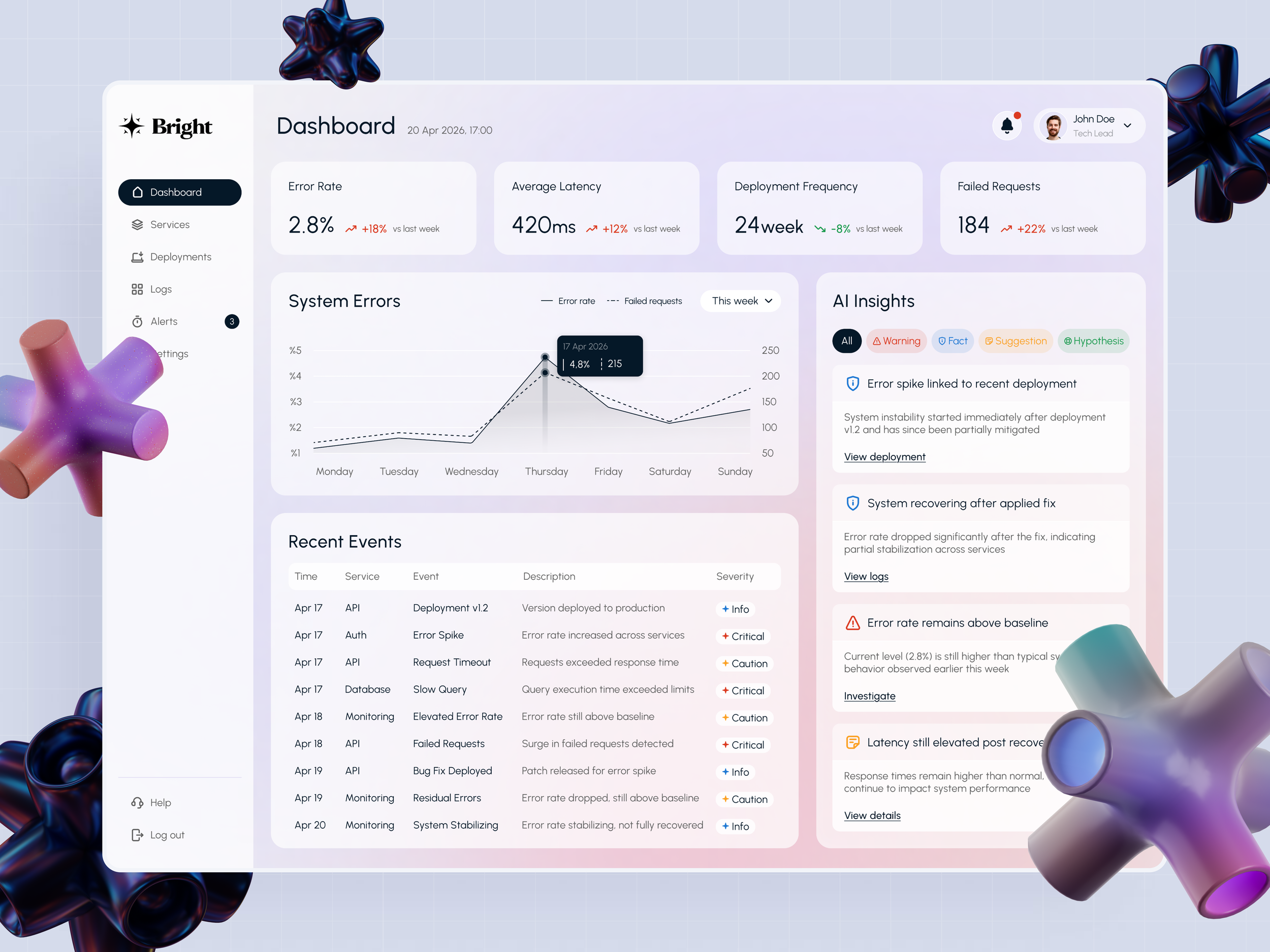
I designed an AI-powered performance monitoring dashboard for a B2B SaaS platform, targeting DevOps engineers and technical leads who need to manage system health proactively rather than reactively.
Research
Without access to a real product team, I relied on secondary research. I spent time on G2 and Capterra reading reviews from real DevOps users, explored discussions on r/devops, and studied existing monitoring tools like Datadog, Grafana, and New Relic. One pattern kept coming up: users weren't struggling to find data, they were struggling to know what to act on first.
That became the central design challenge.
Design Challenge
How do you present complex, real time technical data without overwhelming the user? The dashboard had to balance depth with clarity, giving engineers everything they need while making the most critical information impossible to miss.
Design Approach
I followed a data driven design process, moving from research insights to information architecture before touching visual design. The hierarchy question came first: what does a DevOps engineer need to see in the first five seconds of opening this dashboard?
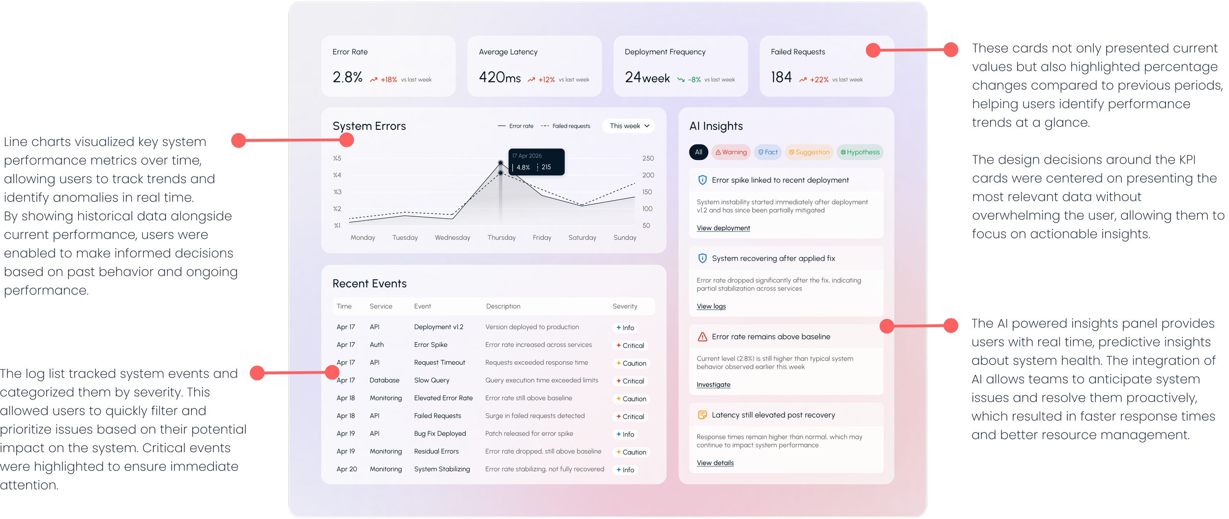
From there I built out the KPI cards, real time charts, and AI insight panels iteratively, constantly asking whether each element earned its place on the screen.
The hardest part was restraint. Every metric felt important. But a dashboard where everything is highlighted means nothing is highlighted. Learning to remove rather than add was the most valuable skill this project developed in me.

What I Learned From This Project?
In data heavy interfaces, the most important design decision is what not to show. The more information you put on a dashboard, the less useful it becomes. Surfacing the one thing the user needs at that moment, that's the real craft. This project fundamentally developed how I think about information hierarchy.
What’s Next for the Dashboard?
If this were a real product, the next logical step would be moving from reactive insights to truly autonomous ones, AI that doesn't just flag an issue but suggests a fix, or eventually resolves it without human intervention. Self healing infrastructure is where the industry is heading, and a monitoring tool that anticipates rather than just reports would be the natural evolution of this design.